Please select a project to explore more.
-LATEST PROJECT-
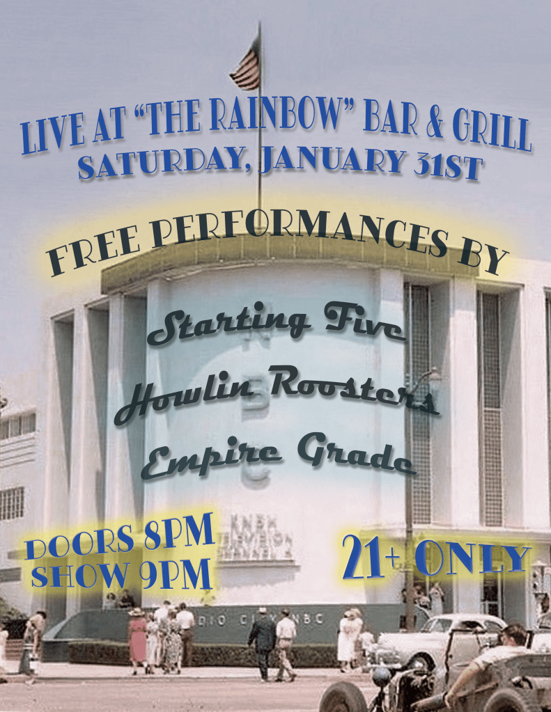
This was my first time designing a flyer for a fresh new band, Empire Grade. My past coworker notified me that her son’s band needed a flyer made up, and her hope for them to avoid using AI. I contacted him, and we worked together with how the layout should be, and provided the information. A small free show at in West Hollywood with 2 other bands performing. This was fun to do.
-PAST PROJECTS-
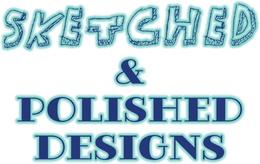
I created Sketched & Polished Designs as the first name for my brand. I wanted to show in this design that I start all my ideas with just a sketch as shown in the left image. I then spent many hours digitally painting the finished image to the right. My desire is to someday design clothing so this was also a way to express my desires and ideas.
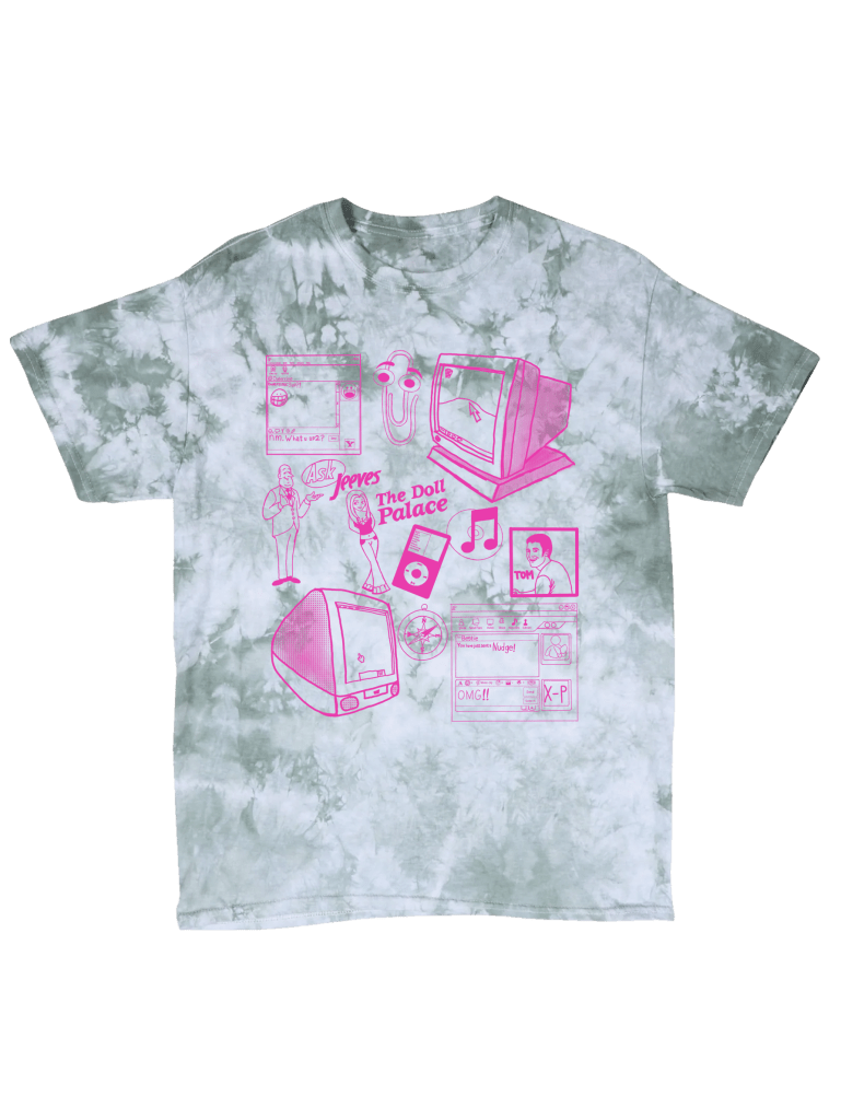
My first ever shirt design that is going to be produced onto actual merchandise. I came across an advertisement from an company named RAW PAW promoting their newest contest coming up. The theme was world wide web, so being a millennial who grew up with the internet, this was a fun challenge. I used a lot of elements that made the most memories for me, but I wish I could have added more. My overall goal was to sell 10 tshirts, within 45 days, May 15th to July 1st. The challenge came to a close and overall, 16 shirts were bought from various friends and family. Thanks to everyone who helped achieve my goal and then a little extra.
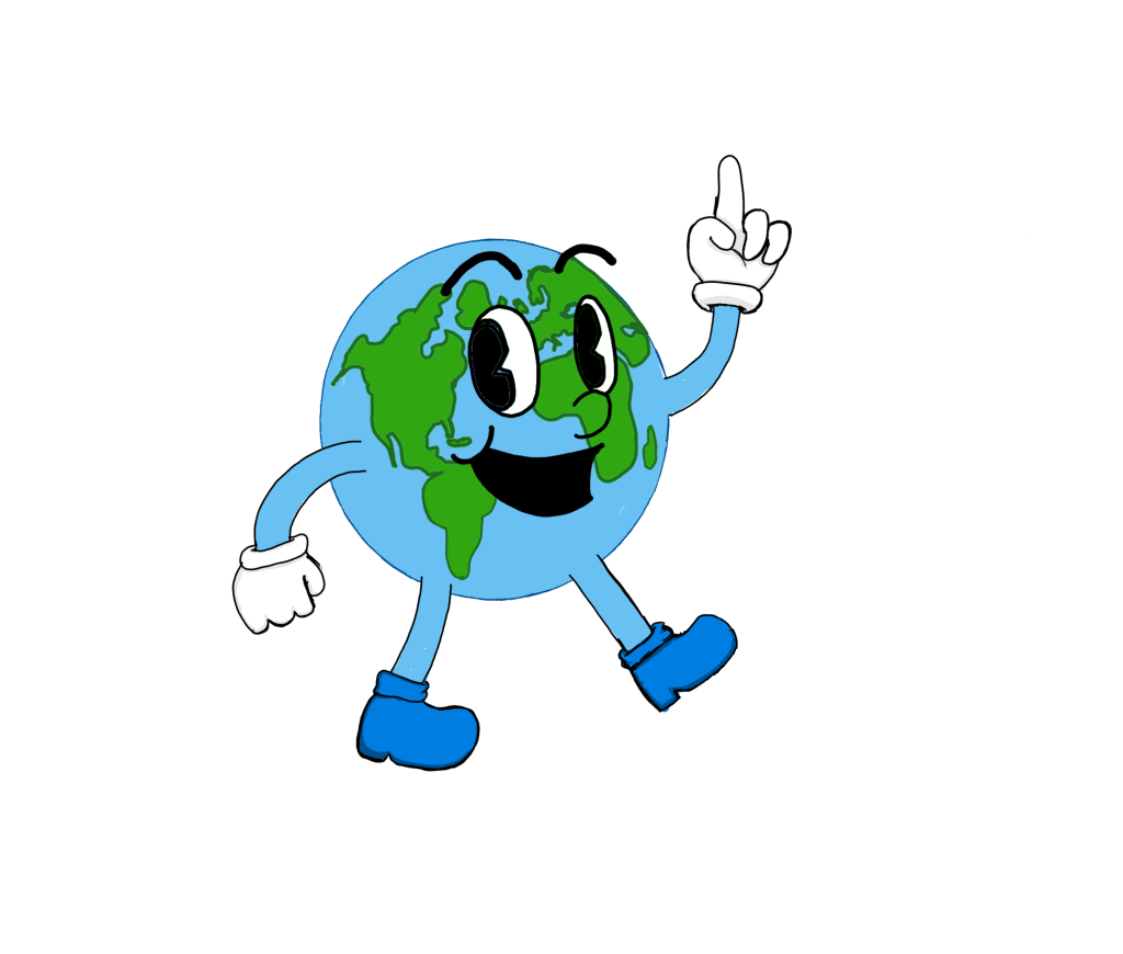
My starting goal when becoming a graphic designer was to create apparel and accessories with my designs on them. Starting April 2025, I have decided to start entering into t-shirt design contests. The first one I participated in was for Earth Day at my work. “Our Power, Our Planet” was the theme, so I included elements for alternative energy sources.
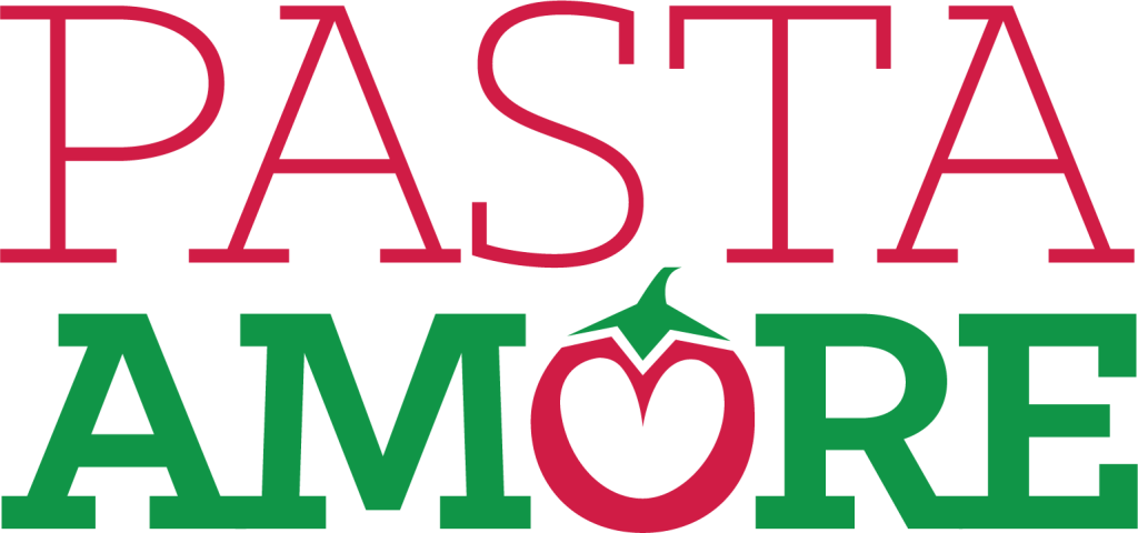
This final project I created was for Pasta Amore, an Italian restaurant that needed a new menu, brochure, and table tent design. The colors and logo used were provided by the client in a style guide. I used the inspirations of Italian restaurants in my area and researched what looks good for designs. I included a QR code for an added treat for guests to enjoy. Check it out for yourself! VISIT HTTP://MANGIAREPASTAAMORE.EPIZY.COM/ TO VIEW WHAT’S COMING.
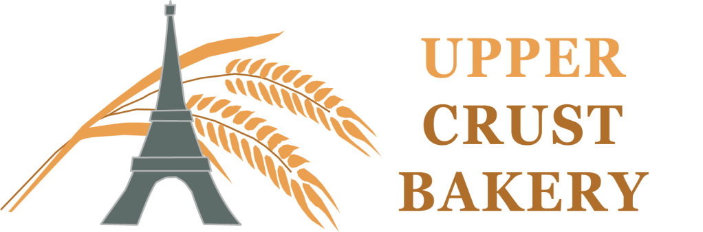
This next project was to create a new brand for a bakery named Upper Crust Bakery. For another project for Southern New Hampshire University, I made a brand new business card design, letterhead, and envelope. Since this is a French bakery, I wanted to include the Eiffel Tower in the design. The wheat stalk is to symbolize the baked goods made fresh daily.
As a new publishing company starts up, that means a new logo is needed. Mad Dog Publishing is run by the author Timothy Patricks Means. He writes novels of fantasy to pirates of the sea. I knew a logo had to fit the personality of the author, but motorcycles is an interest of Timothy. I had to incorporate a bike into the logo.
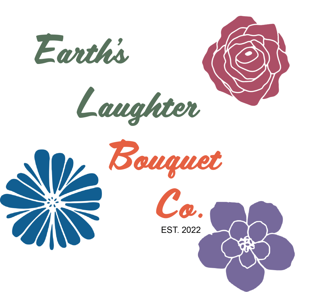
Starting up as a side business job for my friend, I offered to design a logo for her. She specializes in using wood to create beautiful flower bouquets, and now flower crowns. The colors are so bright and beautiful, while the detail is impressive. I used colors from image references and felt the font type worked wonderfully with the essence of her business.
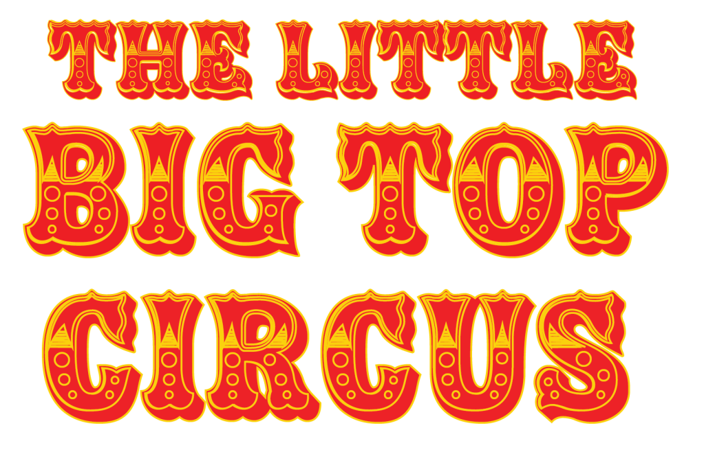
The Little Big Top Circus was a project that I was very new to in terms on Adobe Illustrator. I was assigned the task to try and create an advertisement for the circus beginning from scratch. I was able to research old vintage posters, as well as some other useful resources to get the idea of a circus. Using resources from Freepik, I was able to create this billboard ad.
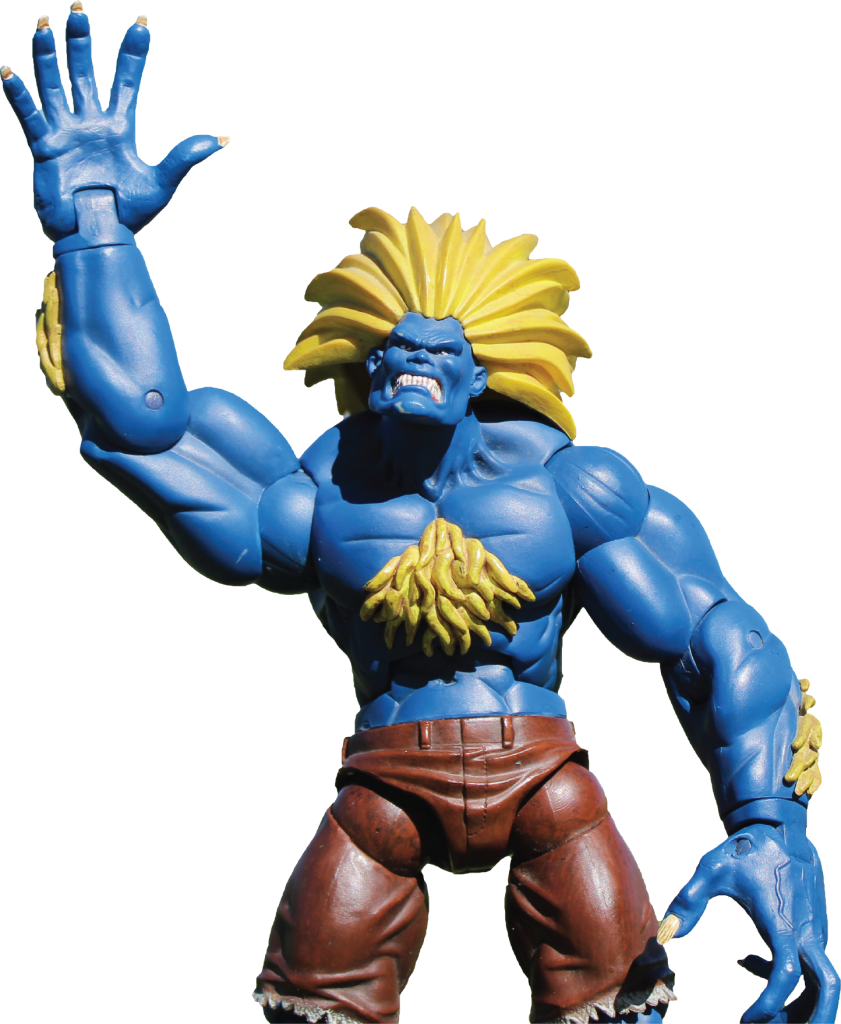
When learning how to use a digital camera, one project that I thought of was a storybook documenting an action figures trip to my city, San Diego. I had thought that using a Street Fighter character, Blanca, as the main model would be a funny idea. I had known of people taking photos of figures almost as if they are alive, so this was my chance at it.
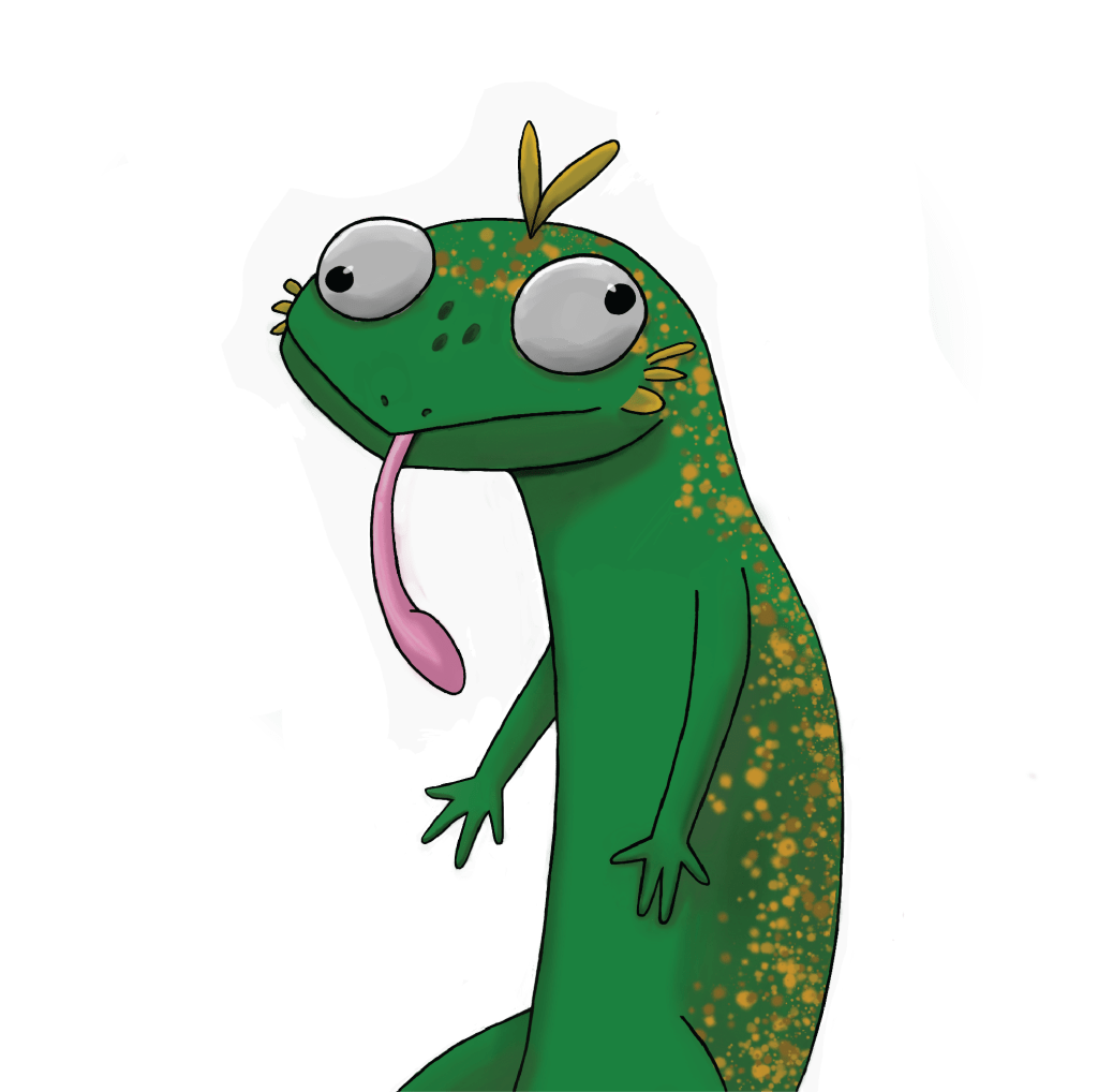
As seen in the previous project, I have created this creature which I named Blurb. He is supposed to be newt and axolotl mix, but with a silly cartoonish face. This is part of how I personally illustrate, and the next project to be presented will be similar in style. This was created with Krita
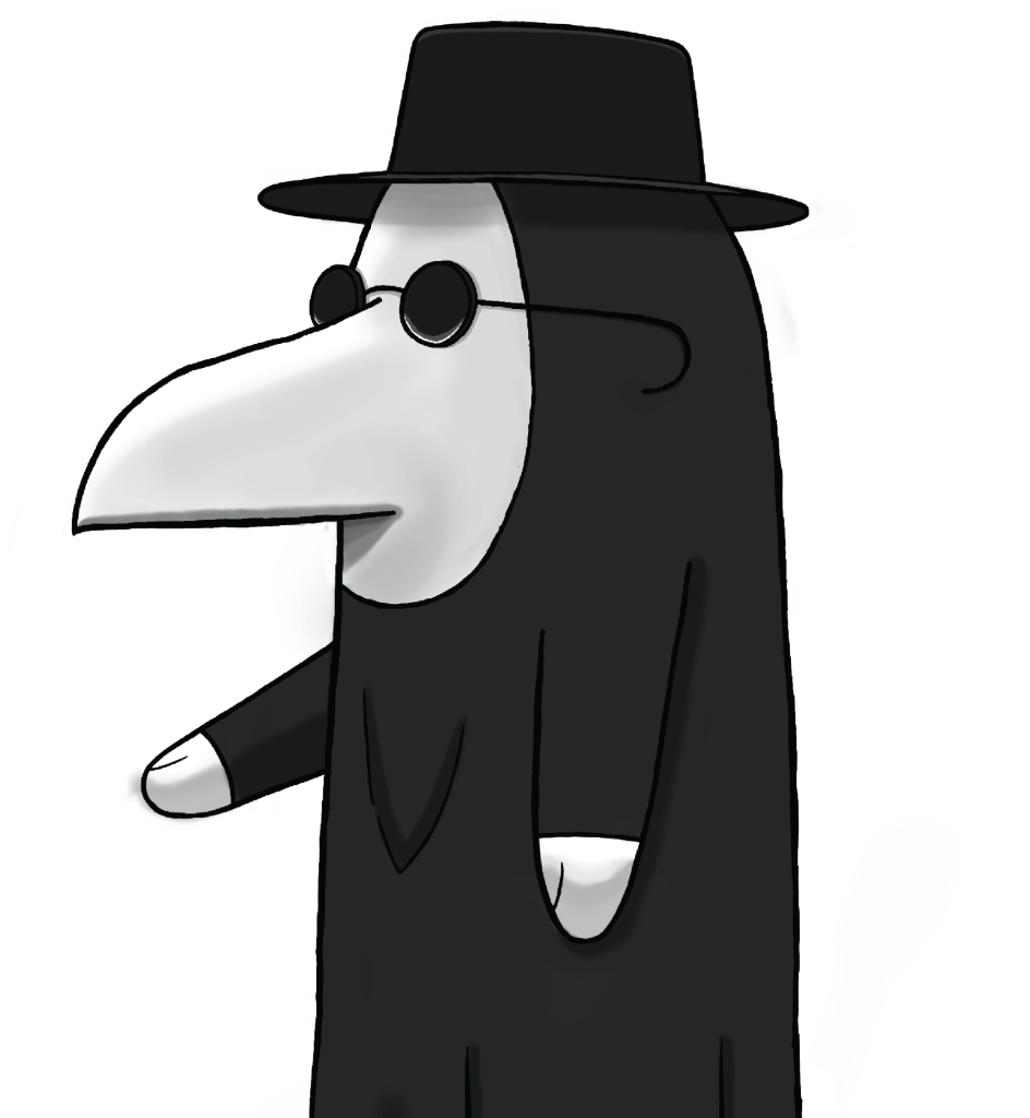
This next illustration project was done shortly after completing Blurb. This was during the beginning of the covid-19 pandemic and a lot of plague doctor videos were being made online. I had the inspiration to illustrate my own plague doctor in a well lit cemetery, showing my name on one tombstone and another as a joke. This was created with Krita
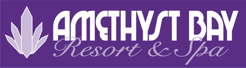
Amethyst Bay Spa and Resort was an interesting project to do. I was given a style guide to follow and tasked with creating a new advertisement for the location. I know that since this was a resort and settled on an island, I knew it had to include a beautiful ocean view and massage. Anyone who wants to visit a spa hopes for a massage, am I right?
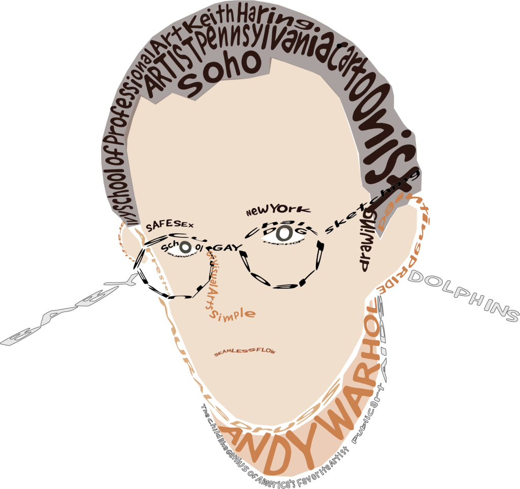
This typography project was one from another class I had taken where I had to choose one celebrity I looked up to. I chose Keith Haring because his style has been my one of my absolute favorites. The simple lines are drawn so seamlessly and yet so smooth. I watched and learned about his life in order to add those elements into this project.